Ghee
Main Character
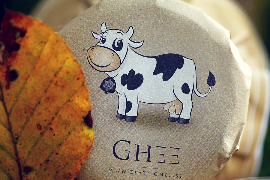
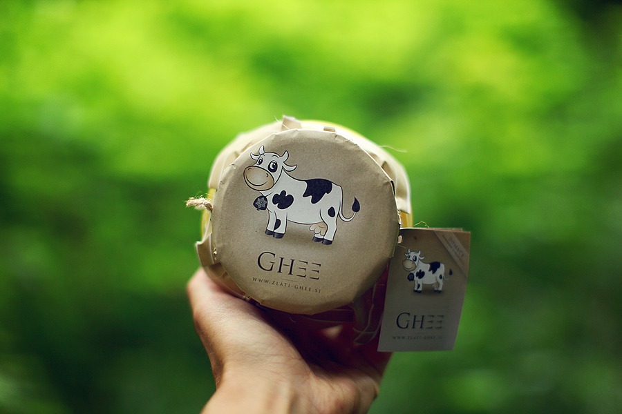
What’s ghee made of? Aha, butter. What’s butter made of? Aha, milk. Where does milk come from? Aha, cow. Well, we need shapes similar to human face to begin with. Why? Well mom and dad, first shapes being modeled, had those properties. So we probably won’t totally miss the direction.
Happy cow on “organic” background sounded like a good idea to start with. Through iterations cow became happy, playful and she get a lot of “white-space”.
Product became a success. Few years after I helped my friends launching “their passion”, it is now sold in every grocery in our country.
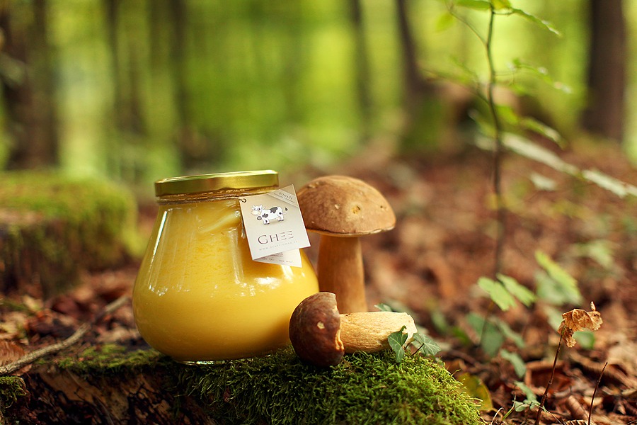
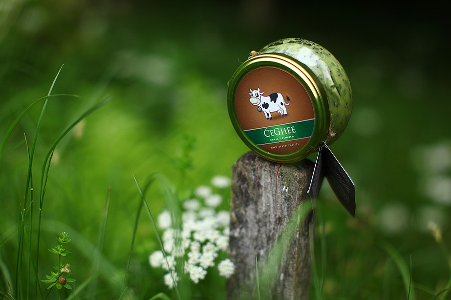
Nature as design context
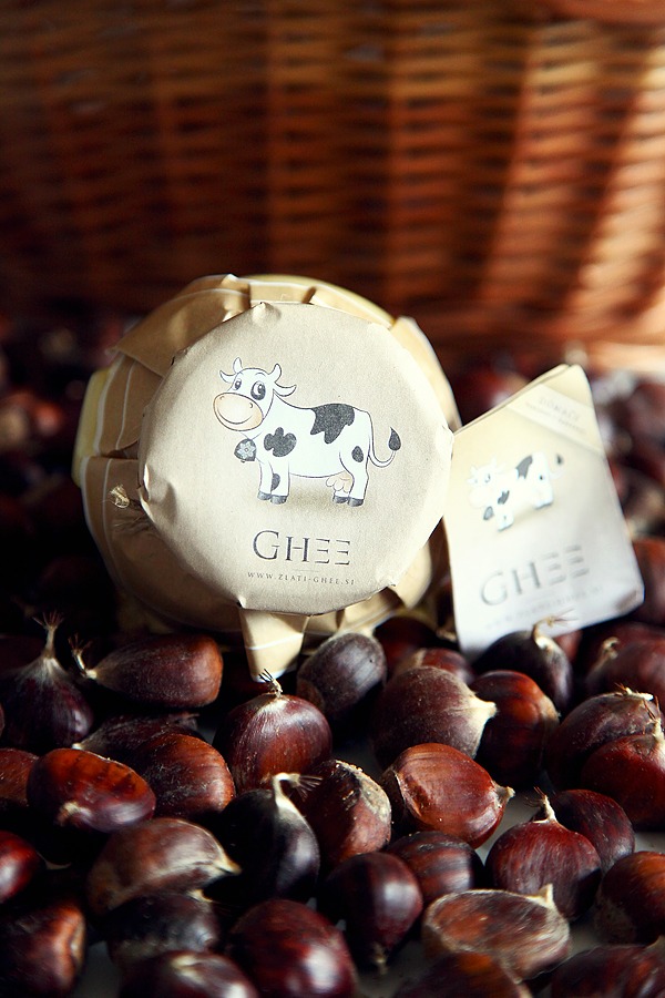
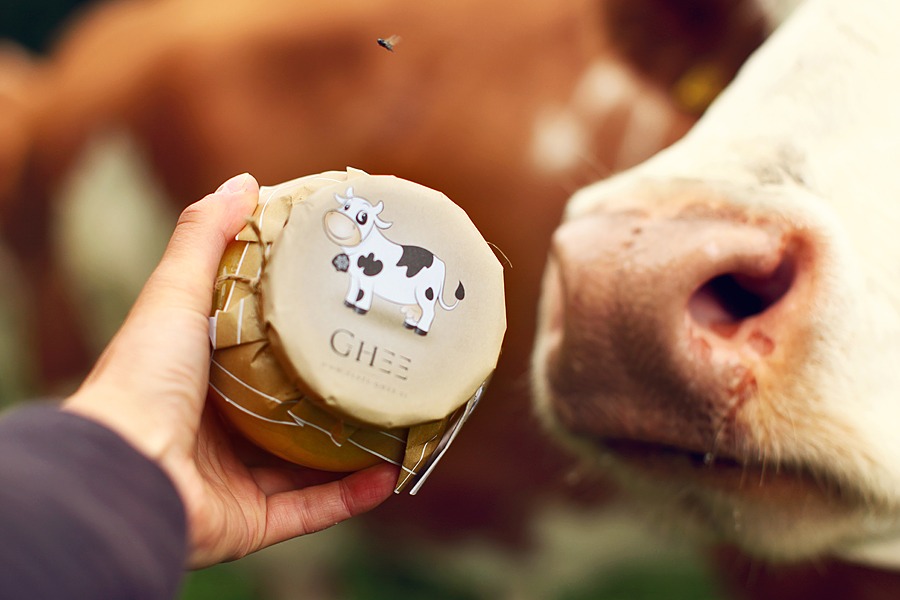
Communication focus can be achieved through carefully crafting the context where item of interest appears. If it’s not defined by designer, other people fill it in and most often then not – screw it up. Therefore all trusted corporate designs like Apple, BMW, etc. define context very precisely. We could go for white background for the design to stand out, but I decided for the product to appear always in “nature”.
I think it works great, don’t you?
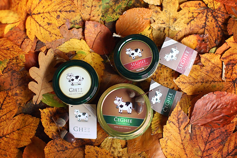
Product Spin-off
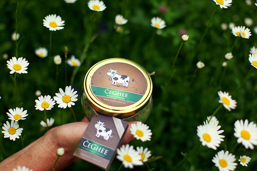
From the beginning there were other products in mind which have to be distinctively different. At the same time each successive design mutation should somehow seam a part of the same family. I slightly changed background circular gradient and added more aggressive color, which represents flavor or a sent. Example below is a ghee with wild garlic (sl. čemaž).
We came up with naming product strategy: first syllable of the flavor + “ghee”.
There was a lot of resistance with this one since it’s pronounced in Slovenian language very similar to clitoris. I stood behind rational “there’s no bad marketing”, LOL. Nevertheless it was accepted very warmly.
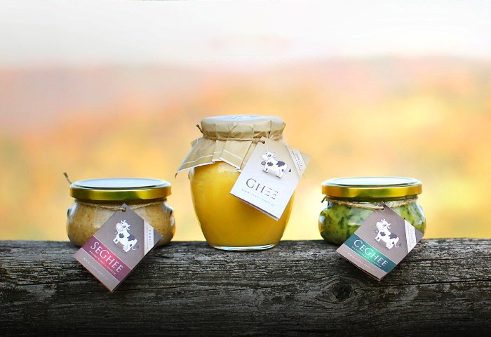
Initial Product-line
From first product spin-off, whole design and naming logic was born. First image below was literally first time I saw the whole product family design in reality.